
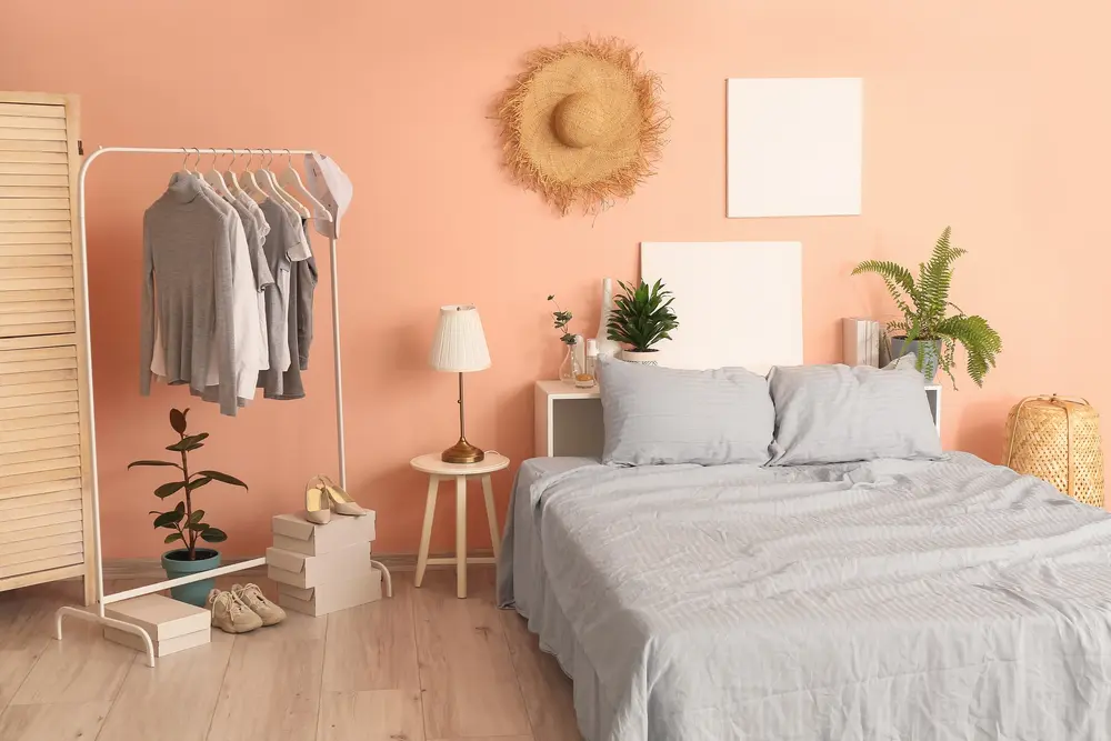
The color peach conjures up images of summer days, Miami art deco, and ripe, fruity freshness, so finding colors that go with peach without accidentally traipsing into gaudy can seem more challenging than it actually is.
To help you choose a palette that works with this energizing hue, we’ve gathered nine colors that go with peach to inspire your next interior design project.
What Colors Go With Peach?
Peach is a dynamic color that brings richness, warmth, and liveliness to any room of your home.
It’s no surprise that this go-to tone continues to make waves in all art forms, including interior design.
Even Pantone’s 2019 Color of the Year, Living Coral, celebrates the animated lightheartedness of this multifaceted pigment.
Peach offers an incredible range of shades, making it a gorgeous pairing across the color spectrum.
It stands daring and dauntless against classic bold options, adds a touch of romance to rich jewel tones, and cozies up melancholic neutrals, making it an excellent choice for any home décor.
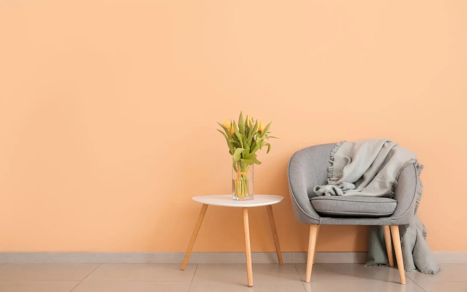
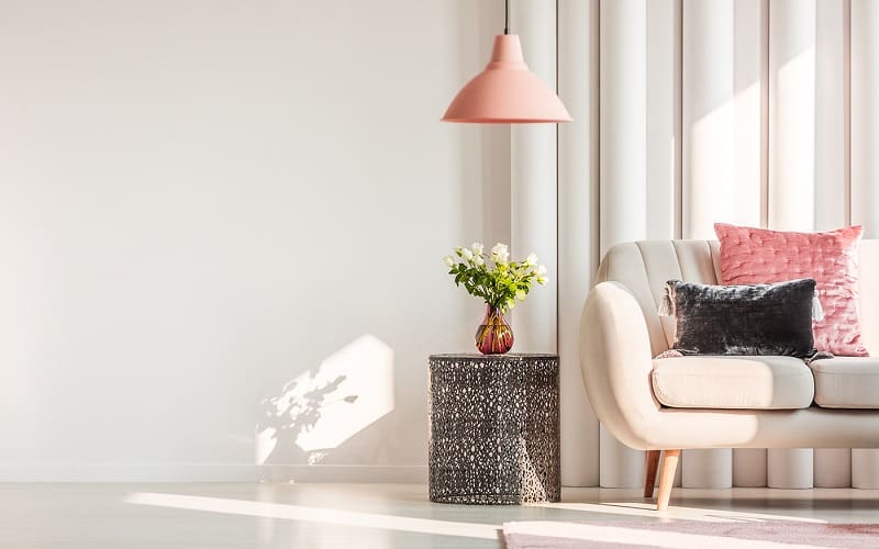
1. Cream

YKvisuals/Shutterstock
Peaches and cream aren’t just a delicious, traditional Southern dessert. The two colors pair beautifully, either as a two-tone neutral backdrop for other pops of color or by bringing in a bolder peach for accent work.
It works particularly well in homes with an open floor plan and large windows, as peach’s warmth won’t look washed out in the brightness of the afternoon sun. Add airy curtains to emphasize the mellow tone.
One thing to remember is that you should be cautious about the shades of cream you choose. Bringing browns into the mix takes the combination from a breezy modern farmhouse to boho California cool.
2. Robin’s Egg Blue

Ground Picture/Shutterstock
Robin’s egg blue and peach are a springtime spin on the classic cotton candy combination, bringing a bit of sophistication and richness to the nostalgic color composition.
By choosing a lighter blue that’s not quite a pastel, you’re ensuring that both colors play nicely with each other, rather than one overtaking the other. That means you can skip neutrals altogether, as the harmonious pairing creates its own unique balance.
Peach and Robin’s egg blue is ideal for a child’s room, where the colors will inspire creativity and playfulness, or an office in desperate need of an inspiring makeover.
If you’re not ready to plunge into a polychromatic design, consider dressing up your bedroom with a touch of Art Deco style by adding a banquette, bedframe, dresser, bedside tables, and shelving in these cheerful shades.
3. Gold

Image/Pinterest.com
The combination of peach and gold screams luxury, though it’s easy to go overboard if you’re not careful about the number of metallic accents you bring into the mix.
While it’s true that it’s typically a palette reserved for weddings, the double hit of warm shades will transform even the dreariest, low-light rooms into a welcoming oasis.
Start with walls in a rich, matte peach with blushy undertones, neutral upholstery, and lush textiles like chunky knit blankets, boldly patterned pillows, and buttery-soft rugs.
Because gold and peach are both authoritative tones, a crisp white keeps the room from feeling too heavily adorned.
Then, add a dash of gold with your choice of eclectic knick-knacks, photo frames, or furniture details. Think gold legs on couches, a chaise lounge with metallic banding, or mirrors with gilded facets.
4. Sage Green

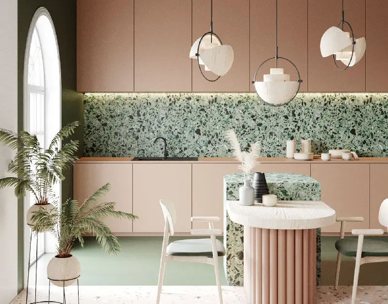
Image/Pinterest.com
Relaxed and calming sage green is trending in interior design circles as it harkens back to nostalgia for the 40s and 50s Bauhaus art school.
This German-bred décor leans on function over form, drawing on themes of industrialism, minimalism, and visual harmony.
Bringing peach to the Bauhaus party skirts the line between stark practicality and avant-garde Art Deco, especially if you use the cheerful tone to brighten up darker areas of your kitchen.
Consider a pop of peach on the crown molding, cabinet interiors, and tile backsplashes to make the room feel larger, or try a more neutral peach tone with sage green cabinets to make the most of your natural light.
5. Navy Blue
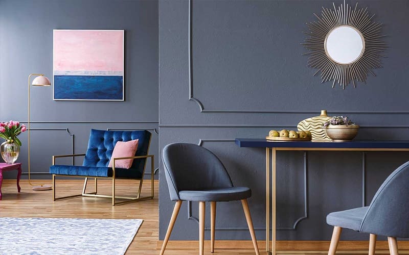
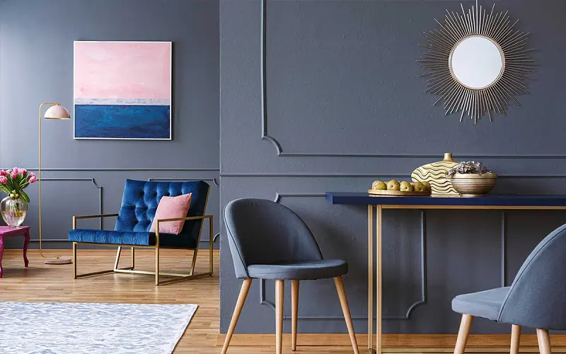
Ground Picture/Shutterstock
Navy blue offers a cool depth and timeless masculinity that pairs well with lighthearted, feminine peach.
The dichotomy is undeniably balanced and aesthetically striking, so long as you make an informed decision about which of the two should be your primary color.
Let light peach take center stage in smaller spaces, like bathrooms, bedrooms, or rooms that don’t get a lot of sunlight. It will appear more luminous, reflecting light rather than absorbing it. Save navy blue for your accent pieces.
Larger rooms or those with uncovered windows can handle the heaviness of navy blue as the primary color, as the touches of peach will add incredible contrast and visual delight. Try focusing on peach in your textiles and reflective surfaces.
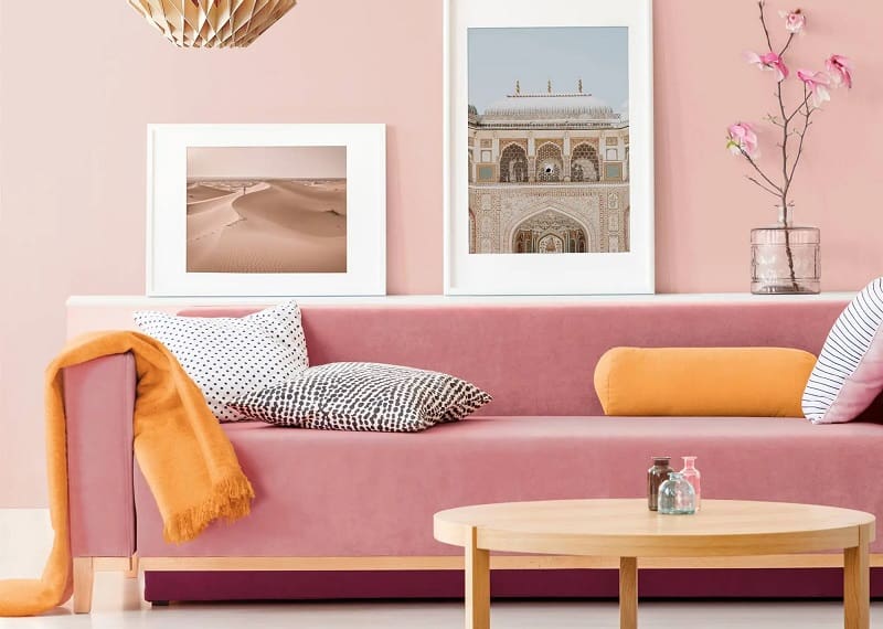
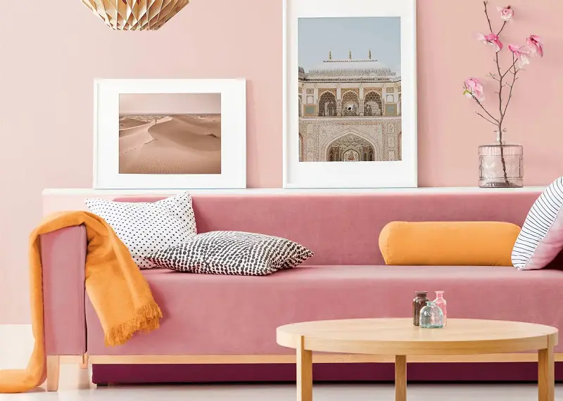
6. Burgundy
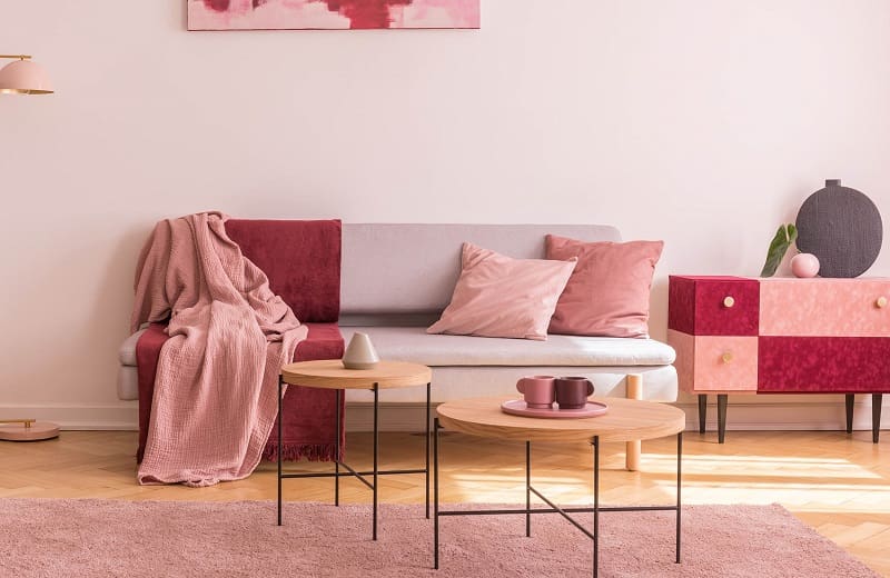
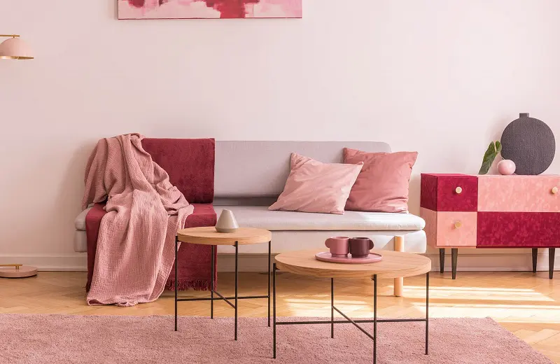
Ground Picture/Shutterstock
Unlike its cousin maroon, which leans more toward purple than red, burgundy revels unabashedly in its nobility and elegance. What better complements the depth and luxury of bubbly, bright peach?
Similarly to navy blue, you’ll want to avoid emphasizing the heaviness of burgundy and instead lean on it to provide contrast to the brightness of peach.
Pay attention to the overall surface area that each color occupies because the former can quickly overtake the latter.
An excellent way to balance burgundy and peach in your bedroom is to paint your walls crisp white with peach molding, floor accents, and furniture, then choose solid burgundy bedding in interesting textures, like velvet or faux fur.
7. Faded Yellow
Image/Pinterest.com
Danish Pastel is relatively new to the interior design scene, but its influences are already making wide ripples in younger generations.
The sweet, candy-coated color palette is anything but cloying and instead brings a rainbow of muted shades into a dream-like swirl of peach, yellow, lilac, and baby blue.
The combination of faded yellow and peach is particularly charming, both of which provoke feelings of optimism, cheerfulness, and warmth.
The color palette stands up to the maximalism of Danish pastel and offers a virtually limitless marketplace of baubles that fit right in with the overall mood of the aesthetic.
A few staples of the style are simple artwork coupled with cheerful typography, lusciously plush area rugs, and Ikea-esque Scandinavian furniture with surprising splashes of color, so opportunities abound to celebrate faded yellow and peach in your textiles and décor.
8. Harbor Gray

Pixel-Shot/Shutterstock
Moody gray and charming peach may seem like strange bedfellows, but the contrast is actually quite stunning.
The subtlety of the neutral color tones down the vibrancy of peach, while the bright, bold shade offers much-needed warmth to the misty, brooding gray.
Mid-Century Modern style is an excellent vehicle for this color combination if you’re in the market for an all-inclusive room makeover.
The curved lines, minimalist décor, and mix of organic and industrial materials open the door for peachy statement pieces that shine against the neutrality of harbor gray.
It also welcomes the use of a contrived patina to bring a little more earthiness to the mix. Harbor gray sideboards and end tables create the ideal canvas for peach-colored plastic statuettes or geometric glass pieces.
9. Cotton White
Ground Picture/Shutterstock
The cooler tones of cotton white create a modern, refreshing contrast with warmer peach hues for a chic “funkiness” that wouldn’t look out of place in a beach bungalow or well-lit loft apartment.
Try bright peach walls for your primary color, then add white trim, curtains, and wall décor. A fluffy, white rug can bring life to hardwood floors, so long as you don’t have to worry about pet or kid messes.
To finish the look, bring in peachy floral arrangements in white vases. The verdant foliage creates a more layered color scheme and adds a touch of organic whimsy.
Things to Consider
Before you settle on your final paint shades, there are a few things to remember to ensure you’ve chosen not only colors that go with peach but also a look that works with the natural lighting, home layout, and existing furniture.
- Clean all of your walls before swatching. Walls collect dust, dirt, fingerprints, and oil that can affect paint application and the final color.
- Create color swatch palettes on the walls of the room you plan to paint. Then, you can test out several different colors that go with peach before selecting your favorite.
- Observe your swatches throughout the day. This gives you a better idea of how your lighting will enhance or mute your chosen colors.
- Don’t be afraid of color. Even a single accent wall in a bright, blushing peach can breathe new life into your home.
- If new furniture isn’t in the budget, there are plenty of options for reupholstering, throw blankets, pillows, couch covers, and other textiles to bring the room together.
Frequently Asked Questions
YKvisuals/Shutterstock
Still unsure if you’re ready to bring playful peach into your interior design color palette?
These frequently asked questions might help you decide!
So, What Colors Go With Peach?
Peach never seems to go out of style, bringing colorful dimensions or inspired neutral tones into your home, depending on the shade.
Its versatility makes it an ideal pairing across the color spectrum, from mercurial harbor gray to endearing Robin’s egg blue.
The key to working with peach is to focus on harmony. Balance is crucial to avoid overwhelming your home with the color’s energetic perkiness while still celebrating its romance and femininity. Happy decorating!