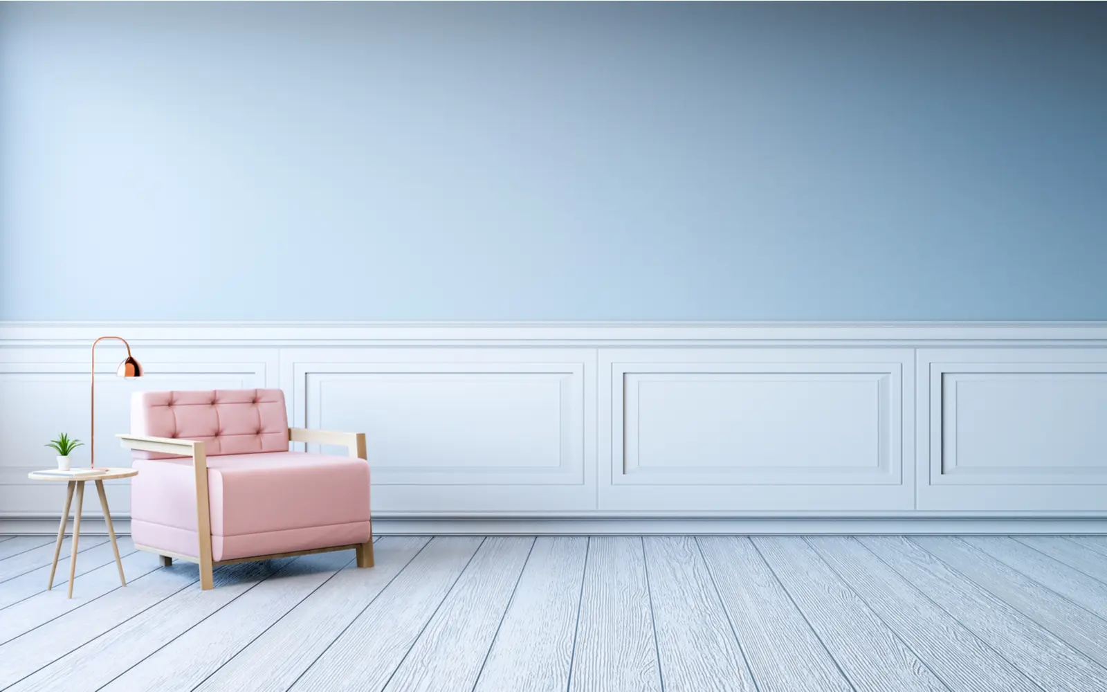
Light blue is a soft and calming color that can become an incredible addition to home décor, art projects, or even outfits.
Lighter shades of blue can truly come to life when you combine them with other hues, but it’s important to find the right colors that go with light blue.
Which colors go with light blue?
Light blue is a versatile shade that pairs well with most neutrals and pastel tones. You can also combine it with rich earth tones or other primary colors.
Contrasting orange tones, like peach or dusty rose, will also look great. Read on as we discuss different ways of pairing light blue with other colors.
How to Choose Colors That Go With Light Blue
Color pairings can change how a room, outfit, or painting feels.
In the article below, we’ll discuss the different ways to enhance a light blue shade.
Color Theory and the Color Wheel
aekikuis/Shutterstock
Colors are a matter of personal preferences, but there is a science behind how pigments complement each other—or fail to do so in some cases.
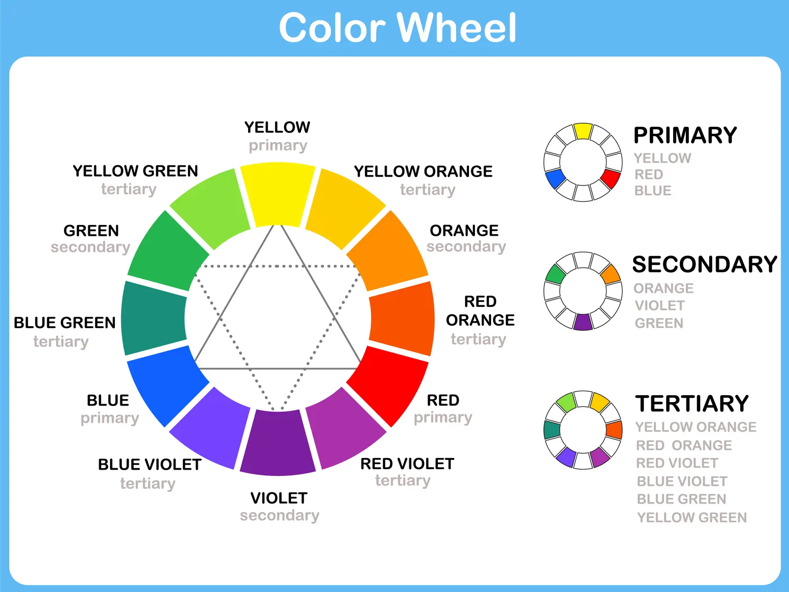
A color wheel is a tool that interior designers and artists rely on to understand the relationship between colors better. Using the color wheel is a great way to identify colors that go with light blue.
The three primary colors, red, blue, and yellow, are equidistant on the color wheel. Between each set of primary colors, you’ll find the secondary and tertiary colors you can obtain by mixing these different hues.
The color wheel is a helpful visual aid to identify adjacent, opposing, or complementary colors. As a rule of thumb, adjacent colors create a harmonious result. Opposing or complementary colors create a stark contrast.
If you want to incorporate a light blue shade in a design project, you can work with adjacent colors like turquoise or aquamarine.
You can go closer to the red section of the color wheel with cool purple shades like indigo or lilac, or get closer to the green portion with lime or pale green.
You can also use complementary colors to create contrast. Overusing opposing colors can look jarring, but the effect can be rich and vibrant.
You’re probably familiar with the 60-30-10 rule in interior design:
- The dominant color represents 60% of the room. It’s usually the color of the walls.
- Your secondary color accounts for 30% of the room.
- The third color, or accent color, represents 10% of the decor with wall art, knick-knacks, or a few pillows.
Using opposing colors for the dominant and secondary colors might be excessive, but creating a neutral canvas with beige walls creates the center stage for a stunning contrast if you use light blue as your secondary color and pick a light orange shade as your accent color.
You can work with peach, melon, or dark tangerine. Instead of using an orange shade, you can opt for an adjacent shade. For a warm result, consider light shades between red and orange. Options include coral, salmon, or dusty pink.
You can also brighten up a room by picking an adjacent color closer to yellow. A rich honey hue, a vibrant fire color, or a muted ochre shade can bring out your blue design elements.
Warm and Cool Palettes
Do you ever feel blue?
We often associate colors with feelings, and research suggests that colors can influence the way we feel. The idea of colors influencing our emotions dates back to the Renaissance.
Artists started thinking of colors as being either warm or cool based on the feelings they evoke. Cool colors like blue or green typically evoke calmness or even sadness.
We associate warm colors like red, yellow, or orange with strong emotions like love, happiness, or even anger. You can play with color temperatures and emotions when combining light blue with other shades.
Light blue is a cool color that evokes calm and relaxation. It’s also the color of the intellect. You can pair it with green, a color that evokes nature, for a soothing effect. You can also combine it with yellow for hope and happiness.
Combining Light Blue and Neutrals
All About Space/Shutterstock
Neutral colors play an essential role in interior design. While bright colors can make a room feel lively, too much color can overpower a space quickly. It can feel overwhelming and gaudy.
Neutrals bring balance to a room. These soft hues are both comforting and sophisticated. They can make a room feel more modern and let details like your accent color and knick-knacks shine.
Light neutral tones can also make a room look brighter by reflecting lighting. Working with neutral colors brings out the versatility of light blue.
There are many options to explore:
- You can combine light blue with a white or off-white shade for a marine theme.
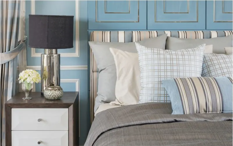
- Pairing light blue with a soft gray can look modern and sophisticated. If you want a darker gray, use a charcoal shade.
- A pale shade of blue can work well with a slightly darker neutral tone like tan.
- Consider working with light blue and warmer neutrals like deeper brown shades for a modern result.
You can also incorporate light blue as a neutral color. The key is to choose a shade that looks muted.
For instance, a pewter blue can fulfill the same purpose as a gray shade. A periwinkle blue can also be an excellent choice for a soft and dreamy atmosphere.
Enhancing Light Blue With Other Pastel Tones
Pixel-Shot/Shutterstock
Pastel colors were a staple of 1950s home decor. These soft hues, characterized by low saturation and high lightness, are coming back.
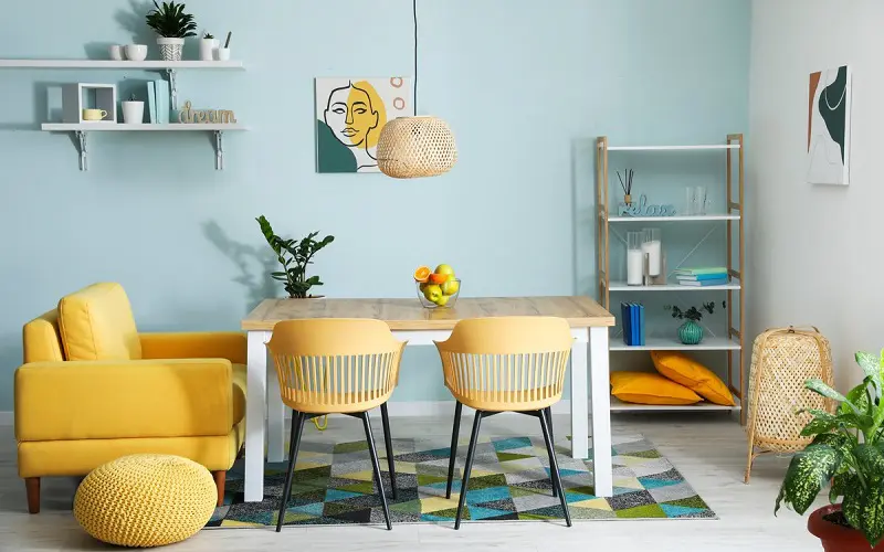
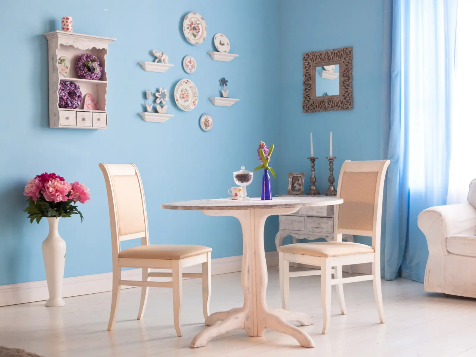
A light blue pastel shade can work with any other pastel color, including dusty rose, lilac, mint, or pale yellow. Working with a pastel palette is an interesting way to incorporate multiple shades without making a room or outfit feel overwhelming.
Pastel colors can create a soft and relaxing feel for a nursery or child’s bedroom, but they can also look more grown-up if you use them as an accent or pair them with a low-saturation gray shade.
Combine pastel hues with home plants for a Zen result, mix them with retro prints for a fun vintage look, or pair them with wood and other natural textures for a sophisticated effect!
Light Blue, Red, and Yellow
Decorating with primary colors is a bold move. We often associate these colors with childhood, and combining light blue with red and yellow will indeed make for a fun children’s bedroom or homeschooling space.
Primary colors can look more sophisticated if you use them as occasional pops of color. Speaking of pop, primary colors have always been a staple of pop art and can look great if you want to create a ‘60s-inspired interior.
Vintage plastic furniture from the ‘60s and ‘70s often features these bright hues along with geometric shapes.
A fun way to incorporate these bright hues is to create a neutral canvas with beige walls and a simple wooden table to showcase a collection of retro geometric chairs in light blue, red, and yellow. Some pop-art-inspired wall art will complete the look.
If solid blocks of color aren’t your thing, floral prints are a great way to incorporate the full range of primary colors. Chintz prints are coming back in style, and their smaller motif is ideal for creating a sophisticated result.
While we usually associate Chintz print with armchairs or curtains, young adults are reimagining this trend by decorating their homes with modern items like wall tapestries.
Light Blue and Earth Tones
Artazum/Shutterstock
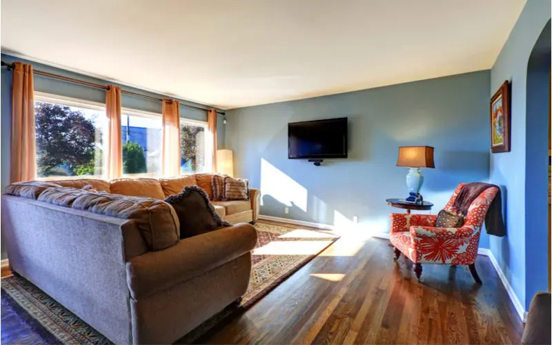
Earth tones have made a major resurgence in home décor during the pandemic. Many people want an interior that makes them feel connected to nature if they have to stay home.
This interest in earth tones and organic materials also reflects an increasing awareness of environmental issues.
Light blue is a wonderful accent color for nature-inspired interiors because it recreates a color pairing that exists in nature with the juxtaposition of vegetation against the sky.
A few discreet light blue accents can enhance warm and rich earth tones like deep brown. Blue is also a great color to bring out vibrant green hues.
You can, for instance, use wall shelves to display your potted plants and paint the wall a light blue shade for a result that looks relaxing and natural. Nature-inspired motifs are a great way to make earth tones look more modern and sophisticated.
Vegetal prints are popular, but a print with motifs inspired by cloud shapes can be a fun way to incorporate light blue into a room.
Light Blue and Other Ocean-Inspired Hues
Kuprynenko Andrii/Shutterstock
While some people immediately think of greenery when creating nature-inspired décor, others prefer a beach or ocean theme. You don’t need a beach house to embrace this trend.
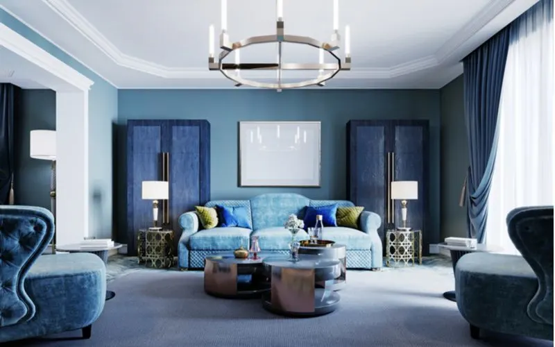
Anyone can have fun and create a welcoming interior with coastal design elements. Traditionally, ocean-themed interiors use deeper shades of blue, like navy blue, to create a contrast with white surfaces.
Opting for a lighter shade of blue can brighten your interior, make you feel more relaxed, and even evoke exoticism with hues like Caribbean blue.
If you want to embrace the ocean-themed trend, consider working with an entire light blue palette that includes sky blue, baby blue, aqua, and turquoise.
You can use a light yellow sand color as a neutral and introduce pops of color with hues you would find on tropical fish or seashells. Coral, cadmium yellow, and raspberry are excellent choices, along with deeper blue shades like teal or lapis.
Frequently Asked Questions
Lapina/Shutterstock
Are you planning a home décor project or want to learn more about color theory?
How many colors do you need in a room?
It’s a matter of personal preferences. Home décor professionals typically work with a dominant, secondary, and accent color, but you can create a design with several accent colors or have two secondary colors and no accent color.
Consider the size and shape of the room when deciding how many colors you want to work with. Using more than two or three colors in a small space can make the room look busy.
Is light blue a trendy home décor color for 2022?
Blue isn’t one of the most popular colors this year, but it’s a timeless choice that can complement trendy colors like citron, gray-green, or chartreuse.
What are some original ways to introduce blue in your interior?
Replace traditional blue wallpaper with textured wallpaper or adhesive tiles. Play with textures using blue and green glass bottles as decorative items and blue LED lights as accent lighting. If you like DIY projects, paint a reclaimed wood object with some blue paint for a distressed effect.
What Colors Go With Light Blue?
Adding light blue to your interior or an art project will have a relaxing effect. Adjacent and opposite colors, as well as pastel, neutral, and earth tones, are colors that go with light blue.
There are many possibilities to explore; be creative, and don’t hesitate to break the rules!

