

If you struggle to decide on the wall and floor color combinations, we’re here to walk you through how to choose and why.
Colors hold so much power in changing the mood of your home, so it’s best to do it right the first time.
The Best Wall and Floor Color Combinations

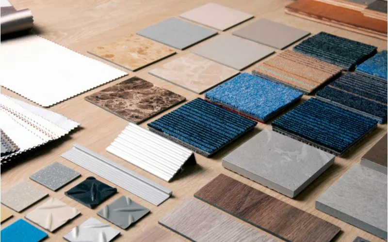
Kingsman Asset/Shutterstock
The short answer to perfecting your wall and floor color combinations is to go with your gut and keep it simple! Don’t worry, we have more tips and will get into specific combinations that work well.
But at the end of the day, all we can offer are our opinions, and your opinion is the one that matters the most when it comes to your home!
Check out these ways to perfect the wall and floor color combinations in your home.
1. Nice and Neutral
If colors intimidate and overwhelm you, your ideal color scheme is probably neutral and calming. Soft grays, shades of beige, and off-whites create serene but cozy environments.
Sometimes being surrounded by bright and daring colors can be visually exhausting and make you look busy.
If you prefer to stick with earth tones and neutrals, the combinations are plentiful. We can’t say one neutral color is better than another, but if you are unsure, gray is a beautiful place to start.
Gray is a soft and tranquil color that isn’t as boring as white or as overwhelming as solid black. Combining shades of gray and white creates an ethereal atmosphere, ideal for bedrooms and bathrooms.
2. Lean Into Patterns
If you have any furniture, rugs, or artwork with a distinct and colorful pattern, use these colors throughout the room. Highlighting the colors in the patterns ties the room together well and gives it a cohesive feel.
If your throw pillows have lilacs, paint your walls a purple that matches. Or if your curtains are a stunning blue, incorporate this into your tiled floor.
Bringing the colors in the patterns into the main aesthetic of the room makes your furniture and accessories feel like they belong, rather than looking like an afterthought.
If you want something more neutral but still concerning your patterns, pull the whites, browns, grays, or shades of black from your patterns and use them on your floors and walls.
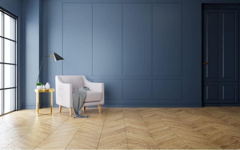
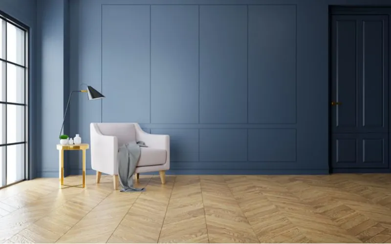
3. Vertical Ombre
A fool-proof way to choose your colors is to decorate from dark to light, starting at the floor. Designers do this because it mimics the aesthetics of nature, where the sky is light and the ground is dark.
You can do this with one color and different shades, or you can use different colors to achieve a subtle ombre.
For example, a bold red floor can lead into soft coral walls and then a white ceiling, naturally creating a comfortable space.
Moving from dark to light in your room can help you figure out where to start choosing colors, as it gives you a sort of blueprint for your color scheme.
Some may view this as a cookie-cutter design tactic, but you can put your spin on it, making a monochromatic room or mixing colors from all over the color wheel.
4. Opposites Excite
You’ve probably heard of complementary colors, which are the colors that are opposite each other on the color wheel.
Despite being opposite, the color pairs highlight and contrast one another in an aesthetically pleasing manner.
The three complementary color pairings include blue and orange, purple and yellow, and red and green.
Of course, there are many shades and color variations between the primary colors. So one combination of purple and yellow could look completely different from the other.
Complementary color pairings work best in living rooms or dining areas where people are more active and social together.
Your kitchen is also a great space to use complementary colors that add a colorful attitude to the room.
5. Similarities Soothe
Instead of using complementary colors on the color wheel, you can use colors that sit right beside each other. The colors next to each other on the color wheel require less effort for our brains to register, making them more soothing.
A bedroom decorated with soft greens and blues will be a calmer environment than a room that combines a bold orange with a light blue.
Color schemes that contrast sharply and are very eye-catching can tire out our brains to some extent. Consider using similar colors in rooms where you want to feel peaceful and serene.
It’s also good to use similar colors in the more casual areas of your home, where formal areas are best highlighted with noticeable colors.
The idea behind this is that you want to impress guests while making the home comfortable for household members.
6. Go Back to Black
Take Amy Winehouse’s advice and use this classically gothic color to decorate your walls and floors. Black is a super dramatic color, creating rich rooms with mystery.
Black is a great color if you want a dark aesthetic in your bathroom or kitchen. Black tiles work well on both the wall and the floor, and their shine often helps combat the overall darkness of the room.
Don’t run from black, as so many do when decorating their home. Black is not the enemy! Especially if you have colorful and eclectic furniture and accessories in your home, a black backdrop can make them stand out and create a distinct space.
7. Combine Hot and Cold
Pairing warm colors with cool colors can create a noticeable and beautiful room. You can go bold, combining redwood floors with soft blue walls that make the room feel light and heavy at the same time.
A stunning way to combine warm and cool colors is in a neutral setting. It may seem like it wouldn’t work, but pairing a soft honey color with a dainty eggshell shade or a steel gray creates contrast without being too bold.
Designs that combine contrast with subtlety are truly marvels, and when you pair hot and cold colors, you can accomplish unique aesthetics.
The two opposites create an interesting tension in the room without clashing. But be careful when trying to pair warm and cool colors, as it takes an attentive eye to nail the right look.
8. Make It Mono
You’ve probably already thought about this, but we’re here to tell you that a monochromatic look is an option! If you were thinking it was too boring or obvious, you’d be wrong.
If you have a color you’re obsessed with or feel like the one color encapsulates the aura you want in a room, use it!
Using the same color on your walls and floor can seem strange. With the right furnishings and accessories, a monochromatic design can create a bold and beautiful look that guests will remember.
If you want another reason to do this, medieval castles often theme their rooms around a specific color. So there would be a “red room, not like in The Shining, a “green room, not like on a talk show, or a “blue room.”
Each room was decked out in its specified color, from the furnishings to the walls to the floors, to create a truly immersive experience. The White House even has color-specific rooms just like this!
Things to Consider
Lekstock 3D/Shutterstock
When settling on your home’s color combinations, there are a few things to consider, like your style and what’s already in your home.
- Personal Aesthetic: If you don’t like the color blue, don’t decorate with it! Even if we recommend a color combination, it may not work in your home. If you like having a minimalist, neutral-style home, you don’t need to bring in bold colors that don’t fit your style. A good rule of thumb is to let your favorite clothes inspire your overall room aesthetic, as you know you don’t get tired of those styles.
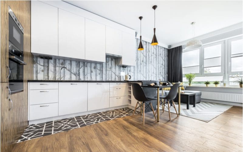
- Wood: While some people may consider wood a neutral tone, it is not. Wood floors and door frames can come in a wide range of colors and grains, so make sure you consider the hue and aesthetic of your wood. For example, a tropical orange paint may clash with birch-colored wood.
- Purpose of Space: Is this your bedroom, where you go to unwind and find peace? Is this your entertaining room, where guests gather for a good time? Consider what the space is for and what kind of aura you want to curate in the room. Don’t paint your bedroom a bright yellow if you aren’t a morning person, because it’ll probably make you moody.
- Furniture: If you have colorful furniture that you love, incorporate these colors into your wall and floor designs. But if you have neutral and simple furniture, you can go crazy with wall and floor colors!
- Personal Comfort: Does white make you feel like you are in an insane asylum? Does red put you on edge? Then don’t use these colors, even if you think they would look nice, and follow the advice in the guide. In the end, you have to love it, or it isn’t a good combination.
Frequently Asked Questions

Cinematographer/Shutterstock
As you settle on your color scheme, some commonly asked questions may arise in your head, so we’ve already answered them for you!
So, Which Floor and Wall Combination Is Right for You?
After reading this guide, you should feel more confident about using colors on your walls and floors.
Decorating with colors can be stressful, but there are so many ways to do it that anyone can create a beautiful combination in their home.